Wayfinding and neurodiversity: why your building feels twice as big to some visitors
Why standard wayfinding fails neurodivergent visitors, and ten principles that fix it — in healthcare, education and public buildings.
A mother arrives at the outpatient clinic with her nine-year-old son. She has the appointment letter with her: route 4, floor 2, check-in kiosk B. Eleven signs are in view in the entrance hall. A ticker display with waiting times. A screen advertising the flu jab. An arrow to "Day hospital", an arrow to "Reception", and an arrow to "Routes 1 – 6" that points left while the corridor runs right. Behind her, a lift door beeps. Her son squeezes her hand, digs in his heels and says he wants to go home.
Nothing is broken in that building. The signs are there, they are legible, they are correct. And still it does not work — not for this visitor, at least.
This is not an edge case. Estimates of how many people are neurodivergent range from ten to twenty per cent, depending on what you count: autism, ADHD, dyslexia, sensory processing difficulties. Add everyone who simply functions poorly at that moment — someone who has just had bad news, someone who does not speak the language fluently, someone who is eighty-two, someone who is running late — and you quickly reach a quarter of your visitors for whom wayfinding is not a detail but the difference between a smooth appointment and a ruined day.
And here is the catch: that visitor rarely complains. They arrive late, they are unsettled, they find your organisation chaotic — and they say nothing about it. You see it back in no-shows, in a reception desk that spends all day giving directions, and in satisfaction scores you cannot explain.
What neurodiversity means for a building
Neurodiversity is the fact that brains differ in how they process information. In a building that shows up in four ways that reinforce each other.
Sensory processing — Where most people filter out background noise and flickering light, for others it arrives just as forcefully as the information they are looking for. A hall with an echo, a buzzing fluorescent tube and three moving screens is then not a neutral space but a space that actively costs energy. Every stimulus you remove gives back attention for reading.
Working memory — "Route 4, floor 2, check-in kiosk B" means holding three things at once, in an environment that is making noise at the same time. Anyone who struggles with working memory loses one along the way — usually the last one.
Literal reading — An arrow pointing diagonally upwards means "straight on and then up the stairs" to most people. To someone who reads literally, it means: upwards. A sign saying "All departments" next to a sign saying "Routes 1 – 6" raises the question of whether those routes are departments too. Ambiguity that most people do not even notice is a full stop for some.
Predictability — Not knowing what is coming is, for many neurodivergent people, more tiring than the event itself. Wayfinding that only says where something is, and not how far it still is or what happens once you get there, leaves that uncertainty in place.
Why standard wayfinding breaks down here
Most buildings are not badly signed. They are signed according to a logic that was in the building file and that has grown organically ever since. Four problems come back almost everywhere.
Too much information in one place — At a junction, everything reachable from there is on display. That is complete, but it forces the visitor to filter — exactly the work that is hardest when it is noisy and stressful.
Names that change along the way — The appointment letter says "Imaging Department", the sign in the hall says "Radiology", the door says "Medical Imaging – X-ray". To you these are synonyms. To someone who reads literally, they are three places.
Accretion — Every loose A4 sheet added over five years — a laminated note about a relocated department, an arrow drawn in with a biro — tells the visitor that the system is not reliable. And if the system is not reliable, they have to read everything instead of trusting it.
Material that works against you — A high-gloss panel under a spotlight is unreadable from the wrong angle. Anyone sensitive to that does not see that something is written — they see a patch of light.
Ten principles that do work
None of these principles is expensive. They mainly require someone to think them through before the signs are ordered.
1. One decision per decision point. At every junction, show only what can be chosen from there, not everything else that exists in the building. Four signs in succession with one choice each beat one sign with eleven.
2. One name per destination, everywhere. Pick one name and use it on the appointment letter, in the email, on the sign, on the door and on the phone. This is the cheapest measure on this list and at the same time the most neglected. It starts with an inventory: which names are in circulation today for the same place?
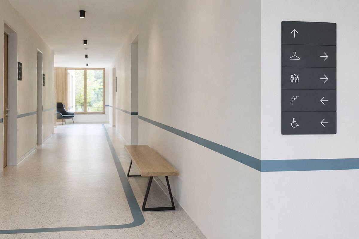
3. Colour and zone as a second language. Divide the building into coloured zones and carry that colour through consistently in the signs, the floor lines, the doors and the floor plan. Anyone who struggles with text follows colour. And "follow blue to the end" is an instruction a nine-year-old remembers too.
4. Pictograms alongside text, not instead of it. A pictogram is recognised faster than a word, but it is rarely unambiguous enough to stand on its own. Together they work; apart they do not.
5. Typography that does not work against you. A sans-serif typeface, generous letter and line spacing, left-aligned, and no words in capitals. Capitals strip the shape out of a word, and that shape is exactly what fast readers rely on.
6. Contrast and a matt finish. Make sure there is real contrast between letter and background, and choose matt materials. A reflective panel is awkward for everyone and unreadable for some.
7. Predictable placement. Always put the same kind of information at the same height and in the same position relative to the door. Anyone who picks up the pattern no longer has to search — they know where to look.
8. Say how far it still is. "Radiology – 150 m" or "two more floors" does more than an arrow. It makes the route finite, and that is exactly what takes the uncertainty away.
9. Provide places to pause. A seat off the main route, away from the noise, is not a luxury. For someone tipping into sensory overload, it is the difference between recovering for a moment and leaving.
10. Start before the door. Put the floor plan online, with photos of the route from the car park and from the bus stop. Anyone who can look at the route once in advance walks in with a plan instead of a question.
This does not only help neurodivergent visitors
There is a classic example from accessibility: the dropped kerb. Built for wheelchair users, used every day by anyone with a pram, a wheeled suitcase or a delivery trolley. Wayfinding works the same way.
One decision per junction also helps the visitor who is in a hurry. Consistent names also help the new colleague in their first week. Colour zones also help people who do not speak the language fluently. Distance markers also help someone unsteady on their feet who wants to know whether they will make it. And a reception worker who is not giving directions all day has time for their real work.
That makes this a business case as well as a human one. Fewer no-shows, less delay in the schedule, less time at the desk, and visitors who associate your organisation with calm instead of stress.
And the regulations?
Honesty is called for here. For physical accessibility there are clear requirements — think of tactile paving that warns people with limited vision about a staircase or a platform edge, or the requirements around evacuation signage. For neurodiversity there is currently no separate standard you can tick off.
That means it is a choice and not an obligation. And that is exactly why it sets you apart: a school, a hospital or a town hall that has genuinely thought about this is noticeable straight away — and your visitors notice it too.
How to approach this
Do not start with the signs. Start with the route.
Walk into your building once as a visitor who has never been there: from the car park or the bus stop, appointment letter in hand, without asking anyone anything. Note every point where you hesitate. That list is your real brief.
Then make the name inventory: every name currently used for the same destination, in letters, emails, signs and on doors. Choose one per destination. This is usually where the most resistance sits and where the most is to be gained.
Only then does it become a question of colours, zones, pictograms and materials — and of which signs need to be interchangeable because occupancy changes.
And test it. Not with the management team, but with a few people who do not know the building. Anyone who hesitates at a junction shows you exactly where the sign is in the wrong place. If you would like a fresh pair of eyes, a site visit can speed that work up.
What we do in this
We design, produce and install interior wayfinding ourselves: door plates, floor signs, floor plans, directional signs, colour and zone systems and standardised pictograms. Because we make everything in house, we can align the plan and the execution instead of handing a design to a supplier who does not know the logic behind it.
Where occupancy changes — a care facility, an office with flexible desks — we work with interchangeable name holders, so that a move calls for a new insert rather than a new sign. And because we also make the exterior signage, the totem at the entrance and the wayfinding in the car park, the route starts where it should start: before the door.
Frequently asked questions
Further reading
Related articles
Ready to make your building legible?
Send us a floor plan and a few photos of your entrance area — that is enough to get started.